Gravitate: A business-driven, people-focused, design refresh
Refreshing Gravitate HR’s Brand for the Future
Gravitate HR, a UK-based HR consultancy, boasts a team of seasoned HR professionals catering to the SME market in the private and third sector. We were entrusted with revitalising the brand, recognising the need for a more unique tone of voice and visual identity.
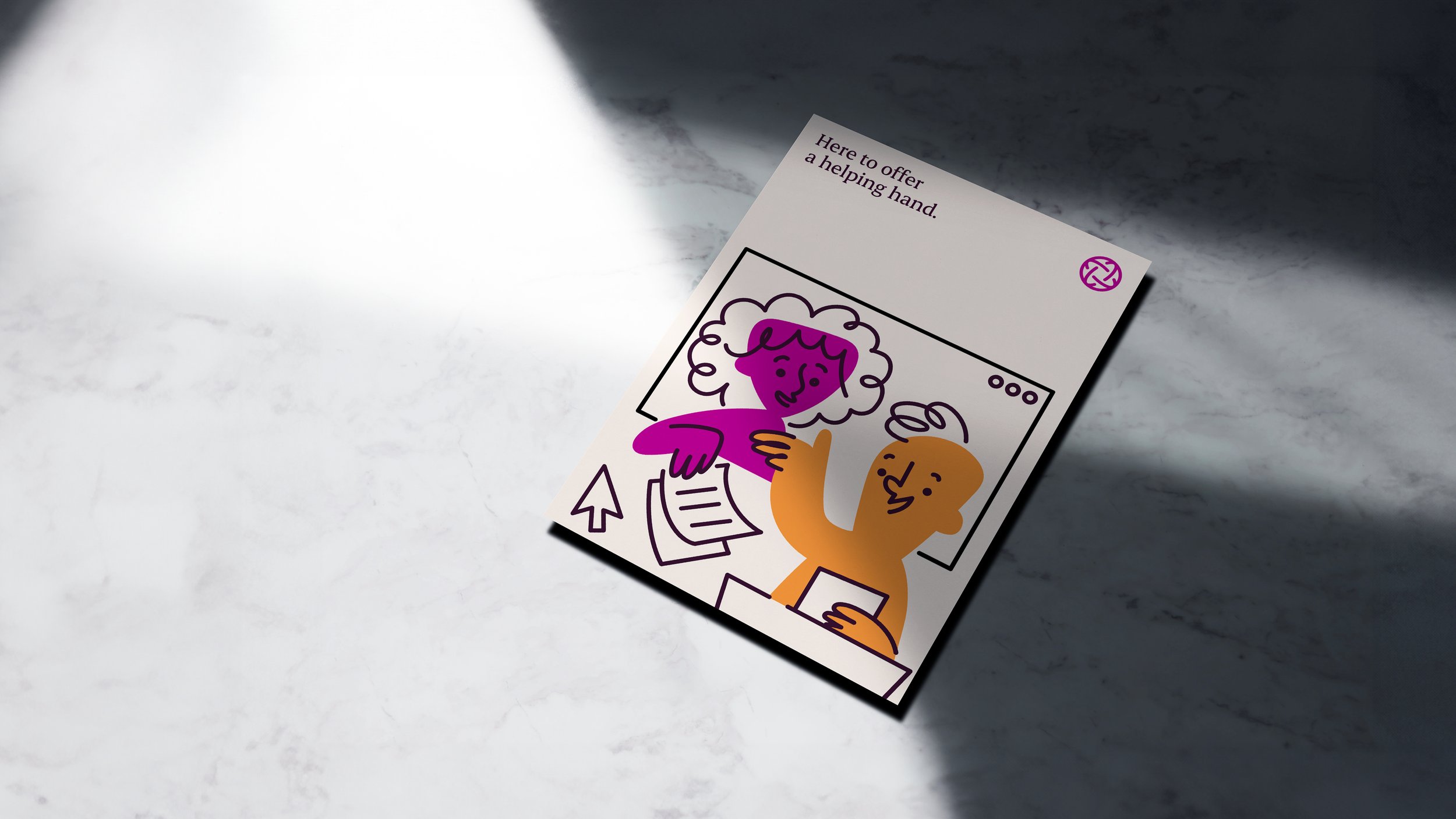
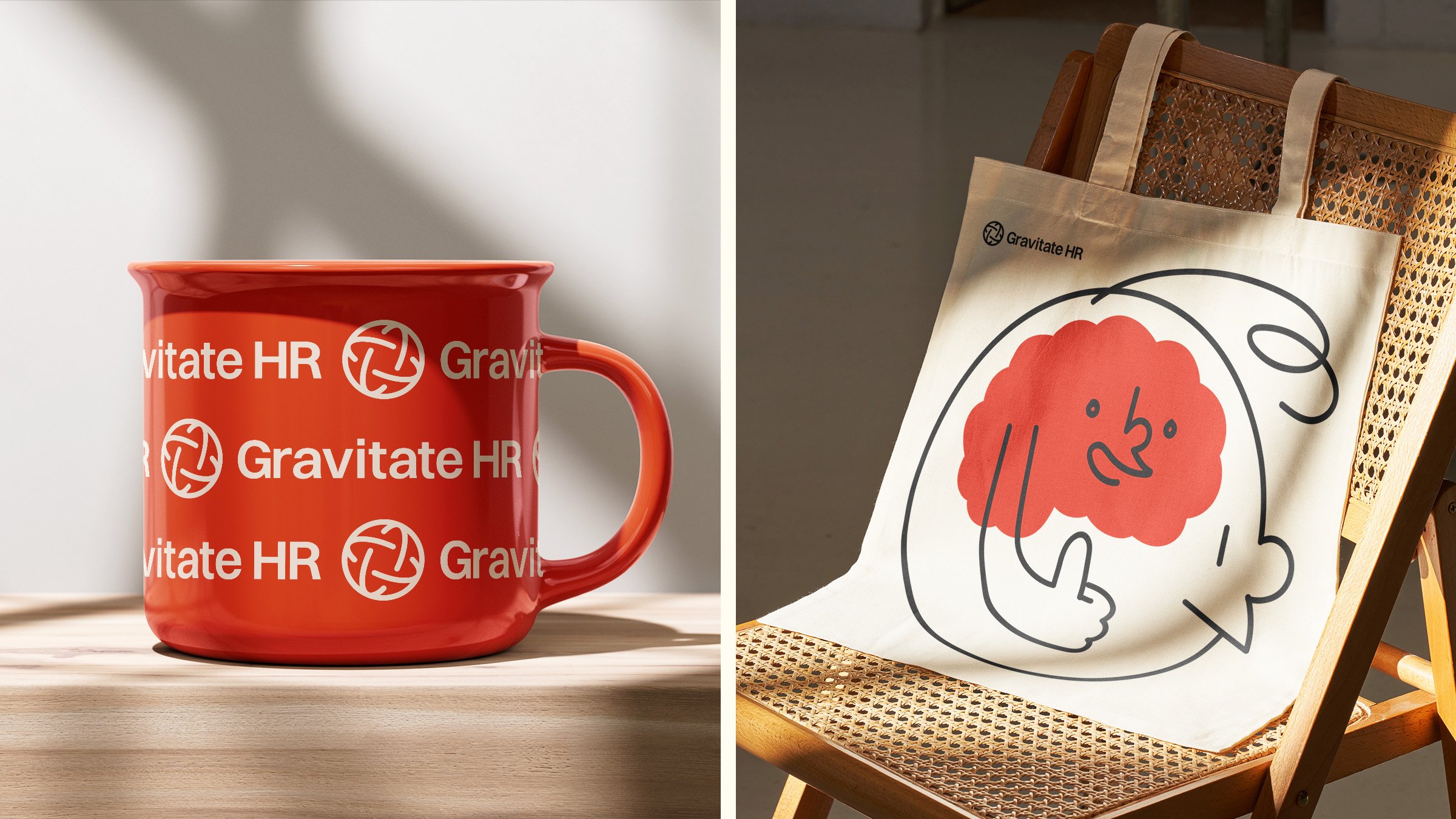
The initial step involved a logo update, featuring an icon that not only symbolises the gravitational pull of planet Earth but also conveys themes of togetherness and global reach. The logo is complemented by a sleek and contemporary wordmark, exuding professionalism and reliability.
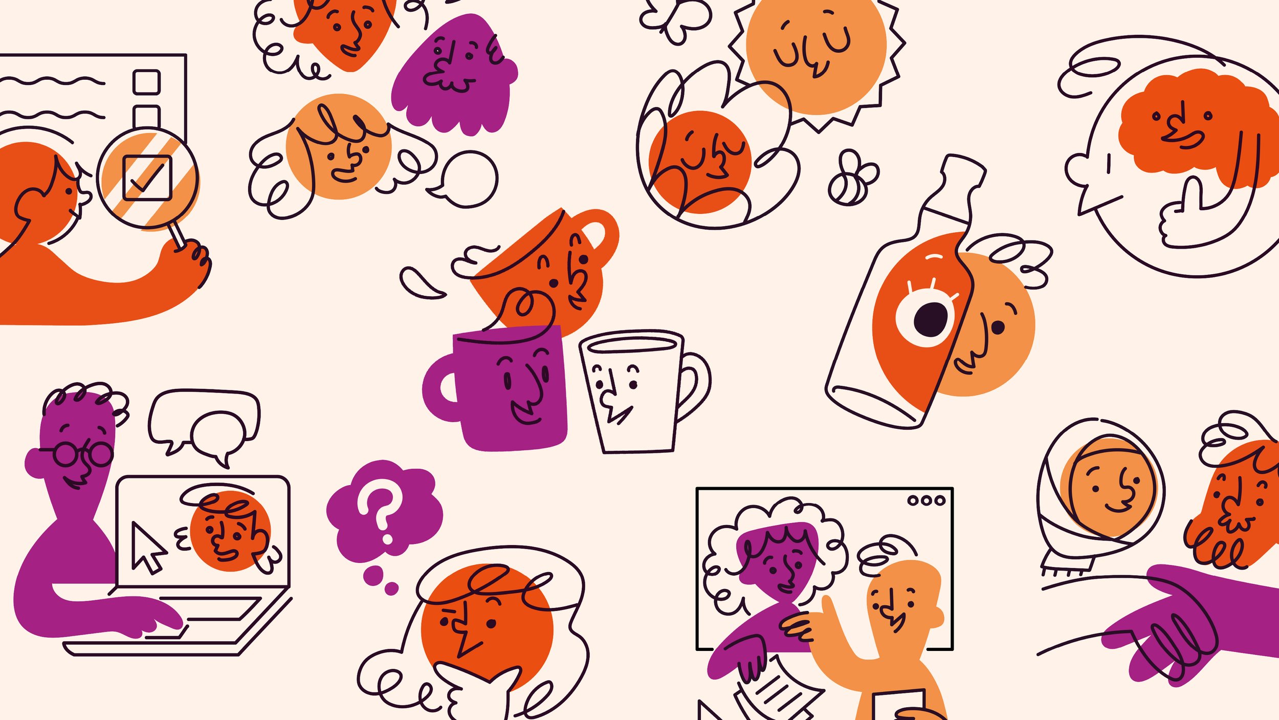
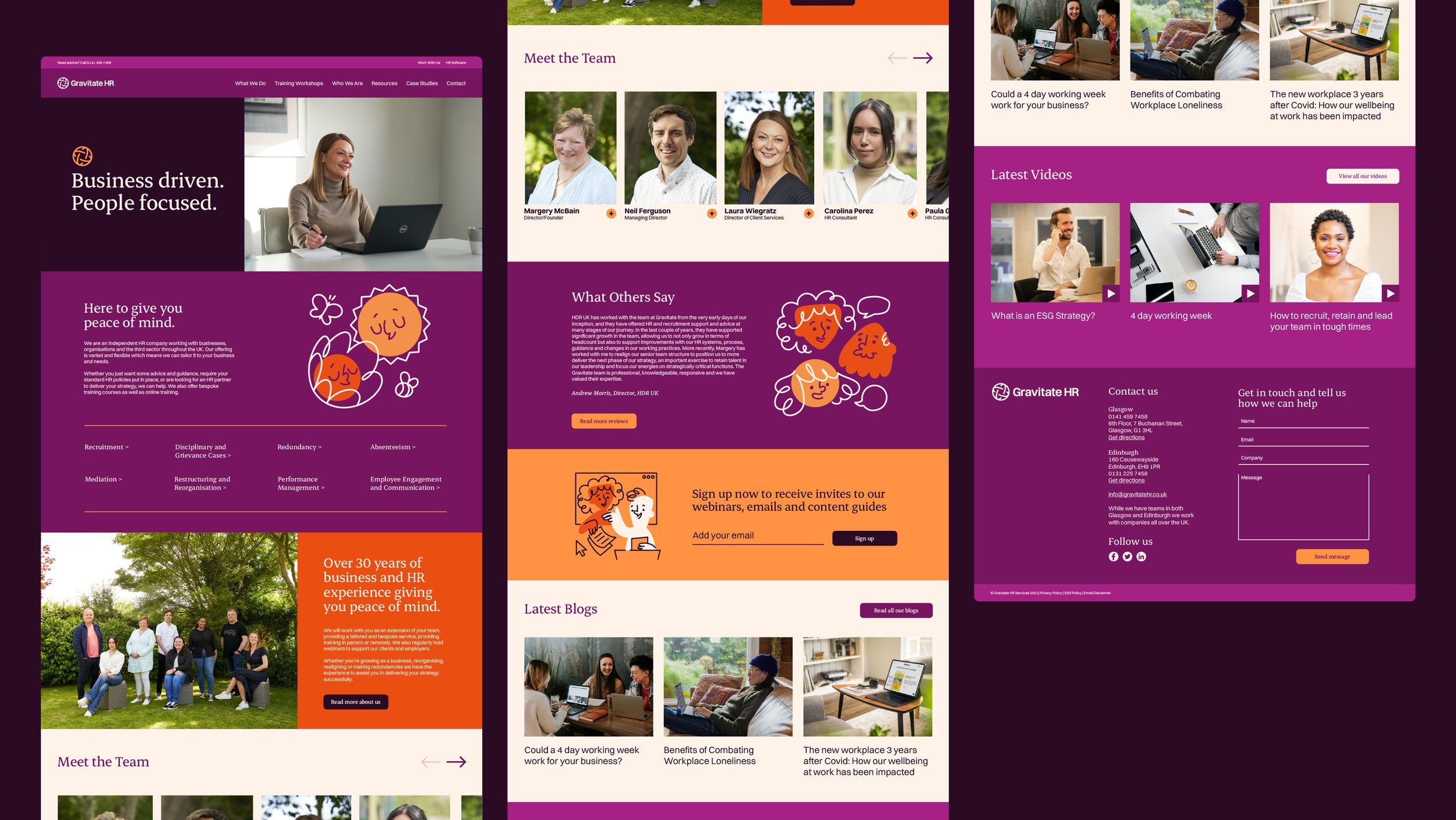
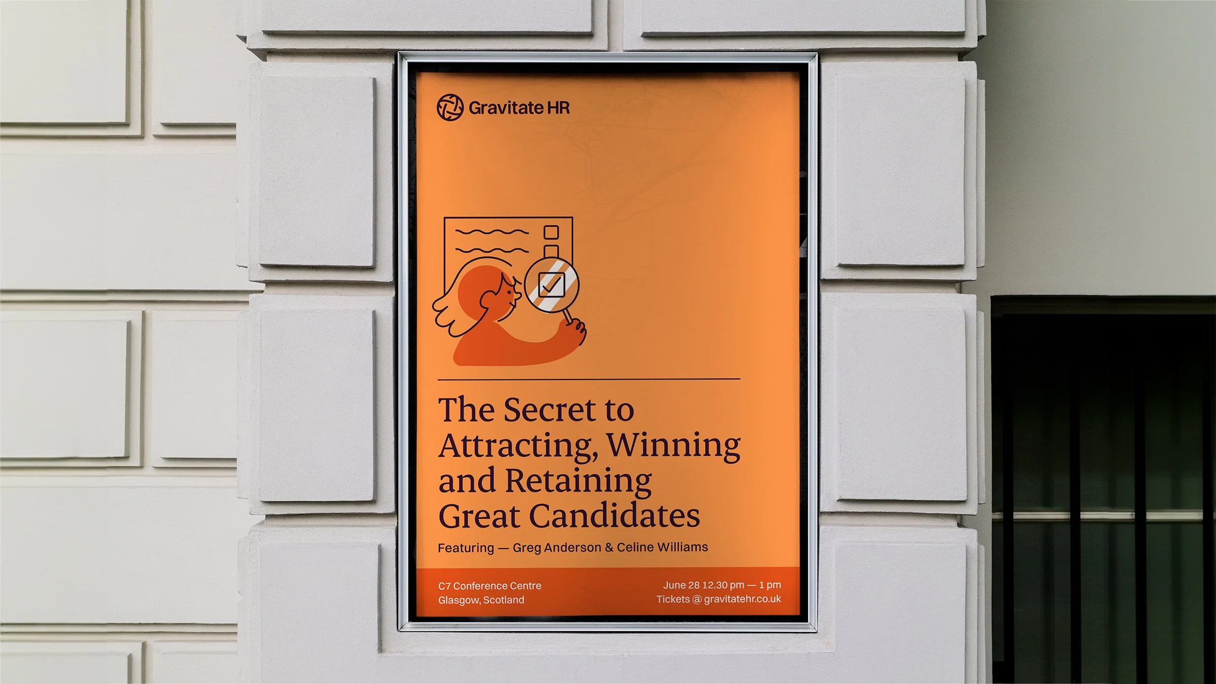
Addressing the foundational elements of the brand, including colour, typography, iconography/illustration, and photography, the objective was to visually express the friendly and approachable essence of Gravitate HR and its team. Retaining the company's distinctive purple, a vibrant and warm color palette was developed to enhance it. An elegant headline font was carefully chosen, paired with a hard-working body font. The illustrations, crafted by Scottish illustrator and Valley Collective member Katie McPherson, strike a balance between joyfulness and representing the key services offered by Gravitate HR. Additionally, the photography was upgraded from generic stock assets to a bespoke library of images by Scotland-based photographer Matt Beech.
These elements are seamlessly integrated to establish a new design language across various platforms, including the website, social posts, email newsletters, webinar posters, and print collateral. The outcome is a robust and personable brand refresh that aligns with the future ambitions of this amiable company.

Credits
Collective - Iain Valentine, Chris Brodt, Katie McPherson
Other - Matt Beech
Some of our work_
More of our projects.